Case StudyUX ResearchMobileUsability TestingInsurance
Progressive Redesign
Streamlining essential digital experiences through design — a UX/UI redesign of the Progressive Insurance mobile app focused on reducing friction and improving task efficiency.
Role
Lead UX/UI Designer & Researcher
Discipline
Research · Prototyping · Usability Testing
Platform
iOS Mobile App
Institution
MICA — M.A. UX Design
01 — Challenge
Where Users Struggle
The existing Progressive app required too many steps to access critical information. Users facing urgent situations — like needing an ID card at a traffic stop or making a bill payment — were met with excessive navigation and confusing hierarchy.
Payment Friction
4+ clicks required to make a payment. Users struggled to locate the billing flow and encountered confusing options once they arrived.
ID Card Access
3+ clicks to access policy ID cards — too slow for an urgent, time-sensitive scenario like a DMV visit or traffic stop.
Additional Pain Points
Long, complex menus requiring excessive digging · Managing multiple vehicles felt repetitive · Dense, text-heavy content overwhelmed users who only needed essentials · Difficulty remembering where documents were stored.
02 — Research
Research Objectives
The study evaluated both a mid-fidelity and high-fidelity prototype across two rounds of usability testing with the same participant pool, enabling direct comparison of design improvements.
Evaluate the redesigned home screen UI and navigation structure against user expectations.
Assess learnability — can users complete key tasks quickly without instruction?
Measure task success rates and completion times across both prototype phases.
Gather emotional response data: confidence, trust in the design, and frustration points.
Determine if the updated layout provides quicker access to policies and better overall visibility.
Compare high-fidelity vs. mid-fidelity results for speed and navigational clarity.
03 — Users
User Goals & Motivations
01
Instant ID Access
Access insurance ID cards immediately when proof of insurance is needed.
02
Fast Payments
Make hassle-free payments without navigating through multiple layers of menus.
03
Policy Management
Easily manage multiple policies, review coverage details, and stay on top of renewal deadlines.
04 — Participants
Test Participants
Six participants were recruited across varying professional backgrounds and education levels, providing a diverse range of mental models and technology familiarity.
Participant
Gender
Education
Occupation
Garrett Rand
Male
Master's
Advanced Project Engineer
Cate McGlynn
Female
Master's
Clinical Psychologist
Daniella Leon
Female
Bachelor's
Front-End Developer
Olivia Prefontaine
Female
Bachelor's
Actress / Model
Erika Rand
Female
Bachelor's
Product Designer
Audrey Leon
Female
Some College
Student
05 — Test Plan
Usability Test Tasks
Each session ran approximately 35 minutes, including a greeting with consent form, two tasks, and a wrap-up. The same two tasks were used across both the mid-fidelity and high-fidelity testing rounds.
Task 01
Making a Payment
You receive a notification that your insurance bill is ready and you want to make a payment. Show me how you would do that.
Task 02
Accessing ID Card
You are about to go to the DMV and need quick access to your insurance ID card. Show me how you would save it to your Apple Wallet / Files.
06 — Mid-Fidelity
Mid-Fidelity Prototype — Results
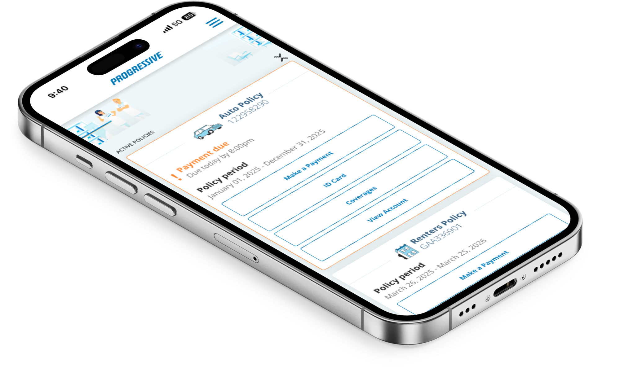
The mid-fidelity round revealed clear strengths in the ID card flow but exposed significant friction in the payment experience. Navigation hierarchy was the core issue — users instinctively reached for the hamburger menu rather than the home screen shortcuts.
Success: ID Card Flow
All participants described the flow as easy and quick — typically 2 to 3 clicks.
Consistent completion without guidance or confusion.
Pain Point: Payment Flow
Multiple users defaulted to the hamburger menu instead of home screen shortcuts.
Confusion about which policy had a payment due (Daniella).
Alternate flows worked but bypassed the intended navigation path (Olivia).
"I would go to this dropdown (hamburger menu) over here to see if there is a tab that says billing."
Cate McGlynn — Task 1
"The thing that confused me is that I didn't know which policy had the payment due. I wish if there was a payment due, I would see it on the home screen."
Daniella Leon — Task 1
"Within three clicks I can add it straight to my wallet which gives me access to my identification card at any time I need it."
Olivia Prefontaine — Task 2
Mid-Fidelity Improvements Applied
Prioritize primary actions (payments, ID cards) directly on the home screen, reducing reliance on the hamburger menu.
Revert to original wireframe with policy cards and clear CTAs to improve discoverability.
Add due payment indicators on the home screen via badges, highlights, or banners.
Add simple instructional text on the payment page to reduce uncertainty about next steps.
07 — High-Fidelity
High-Fidelity Prototype — Results
The high-fidelity round showed dramatic improvements across both tasks. Clearer visual hierarchy, orange notification highlights, and a restructured home screen drove significant efficiency gains and higher confidence scores.
Metric
Mid-Fidelity
High-Fidelity
Improvement
Payment Task Time
~50 seconds
~17 seconds
66% faster
ID Card Task Time
Multiple clicks
5–12 seconds
Significantly faster
User Confidence
~8/10
10/10 (multiple)
+2 points avg.
Navigation Success
Alternate flows common
Intended path followed
Improved
"I like the orange because it makes the notification stand out. Less button clicks to get to the destination."
Garrett Rand — Task 1 (Hi-Fi)
"This task was super easy and I love that there is Apple Pay. All of the buttons have clear labels and they are very organized."
Erika Rand — Task 1 (Hi-Fi)
"I like this screen compared to the previous one because I can see all of my policies in a clearer way."
Cate McGlynn — Task 1 (Hi-Fi)
"I prefer this home screen because I have quick easy access to the different buttons. The ID Card button makes it super easy to access my policy ID."
Olivia Prefontaine — Task 2 (Hi-Fi)
08 — Insights
Key Patterns & Insights
Efficiency Gains
Fewer clicks and clearer paths were consistently praised. Payment time dropped from 50s to 17s. ID card access took 5–12 seconds. Multiple participants rated their confidence 10/10.
Visual Design Works
Orange notifications and policy highlights were effective at drawing attention. Clear button labeling reduced cognitive load. The exclamation point urgency icon was noticed and appreciated.
Remaining Friction
Confusion around "Another Amount" label persisted across both rounds (Daniella, Cate, Garrett). Some users were uncertain about the first step on the payment screen.
Layout Trade-Off
While the new design felt cleaner, one user missed seeing all policies without scrolling. Balancing overview visibility with reduced clutter remains an open design challenge.
09 — Recommendations
Next Steps & Recommendations
01
Payment Flow
Rename "Another Amount" to "Custom Amount." Break payment steps sequentially, graying out later options until an amount is selected. Visually prioritize Apple Pay.
02
Home Screen
Introduce accordion-style collapsible policy cards. Allow users to toggle between compact and detailed views for personalized policy management.
03
Notifications
Use distinct icons per notification type. Switch payment notification to a dollar sign icon for immediate visual clarity. Add instructional microcopy throughout.