American Airlines
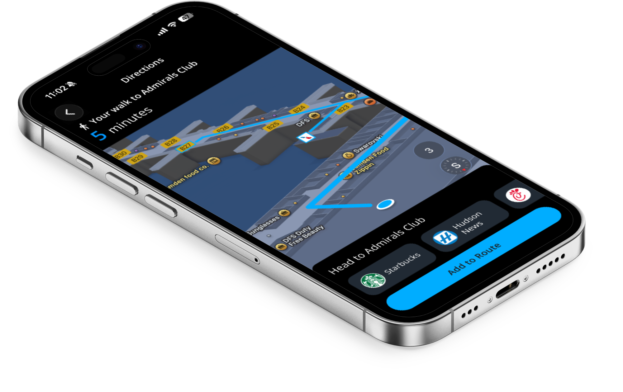
Reducing travel-day anxiety with a unified pre-departure dashboard — bringing real-time TSA wait times, transit tracking, and terminal wayfinding into the American Airlines app.
01 — Challenge
The Challenge
American Airlines passengers experience travel-day friction due to unpredictable transit timelines, security delays, and terminal navigation confusion. The AA mobile app lacked a unified dashboard and predictive tools — like live TSA wait times, traffic notifications, and indoor wayfinding — forcing passengers into a fragmented, multi-app workflow just to get from curb to gate.
02 — Landscape
Competitive Analysis
Before designing, I audited how competing airlines were already solving pieces of this problem. United leans on AI-driven contextual tools throughout the travel day. Delta offers an AI concierge with wayfinding and Uber integration. Southwest layers in TSA PreCheck touchless ID and real-time alerts. Across all three, a consistent gap remained: no competitor combined live flight tracking, gate amenity information, and true real-time terminal wayfinding in one place.
03 — Research
User Research & Insights
I recruited six frequent domestic flyers (ages 25–65) who use their airline's app as a travel-day tool, and ran semi-structured interviews over Zoom. Affinity mapping the transcripts surfaced four consistent patterns: data and information inaccuracy, reliance on external apps, anxiety around transit and terminal timing, and a desire for more granular information like TSA wait times and walking distances.
From there I built two primary personas to ground design decisions.


04 — Journey Mapping
Current vs. Future State
Mapping Jennifer's journey from pre-departure through her connecting flight revealed a clear emotional arc — anxious, overwhelmed, lost, and stressed — driven by fragmented tools and vague information. The future-state journey, powered by proactive AA notifications and a unified dashboard, shifts that arc to confident, calm, reassured, and informed.
| Stage | Current State | Future State |
|---|---|---|
| Pre-Departure | Checks Google Maps, weather, and FlightRadar24; builds a 2–3 hour buffer. Anxious. | Receives drive-time notifications with recommended departure times. Confident. |
| Transit & Arrival | Flips between the AA app, Uber, and MyTSA for security wait times. Overwhelmed. | Opens the AA dashboard to see TSA wait times and walking distance to gate. Calm. |
| Terminal Navigation | Cross-checks terminal screens and Google Maps to confirm gate. Lost / Confused. | Opens a detailed terminal map with turn-by-turn walking directions. Reassured. |
| Connection | Worried she won't make her next gate and isn't sure where it is. Stressed. | Receives automatic terminal navigation notifications with time estimates. Safe / Informed. |
05 — Design
Proposed Solution
I translated the research into four connected features, sketched as low-fidelity wireframes and mapped into user flows before moving into mid-fidelity prototyping in Figma.
Each feature was mapped as a full user flow — from the transit and rideshare integration flow through terminal navigation — before being wireframed into low-fidelity wireflows and built out as an interactive mid-fidelity prototype.
06 — Testing
Usability Testing & Findings
I ran moderated one-on-one sessions with five research participants, walking each through five task-based scenarios on the mid-fidelity prototype using a think-aloud protocol. Rather than pure task-completion metrics, I focused on how each task made participants feel and how their mental model compared to the actual flow.
| Finding | Participants |
|---|---|
| Completed terminal navigation flow unaided | 5 of 5 |
| Said they would use the new AA features | 5 of 5 |
| Preferred terminal nav over Apple Maps | 2 of 5 |
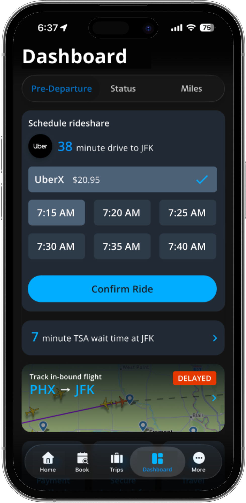
| Flagged missing rideshare pricing/tiers | 2 of 5 |
| Couldn't locate inbound flight tracking unaided | 2 of 5 |
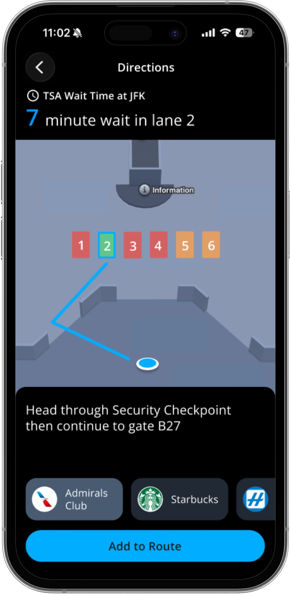
| Requested gate amenity info on the terminal map | 3 of 5 |
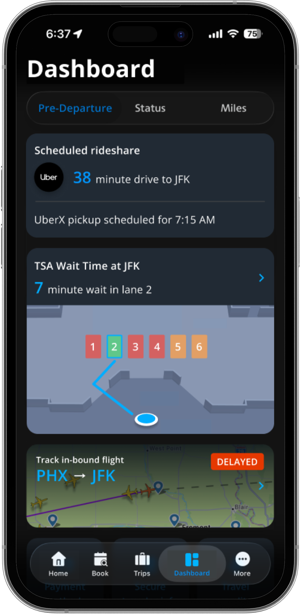
| Wanted more detail on TSA wait times (e.g. fastest lane) | 3 of 5 |
All five participants said loyalty points and miles felt unnecessary on the dashboard — a strong signal to deprioritize that content in favor of travel-day utility.
07 — Iteration
Design Changes
08 — Solution
The Final Prototype
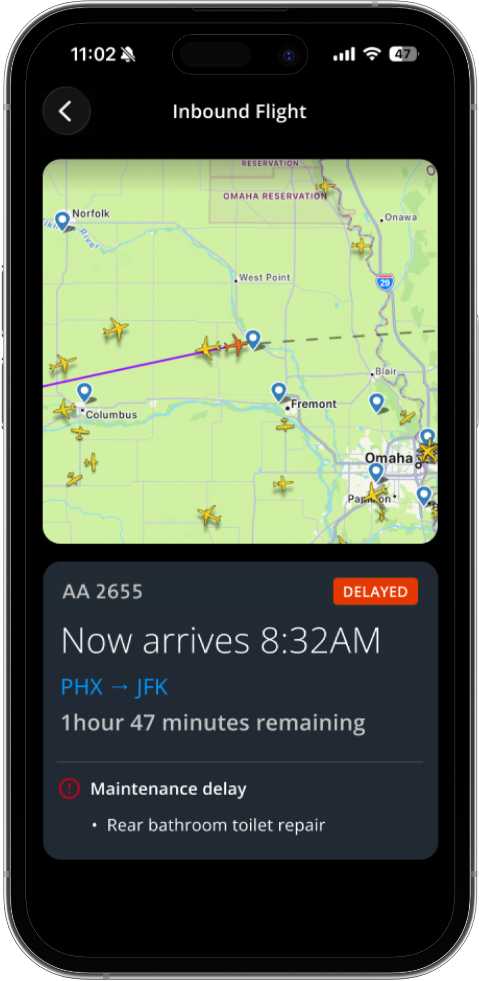
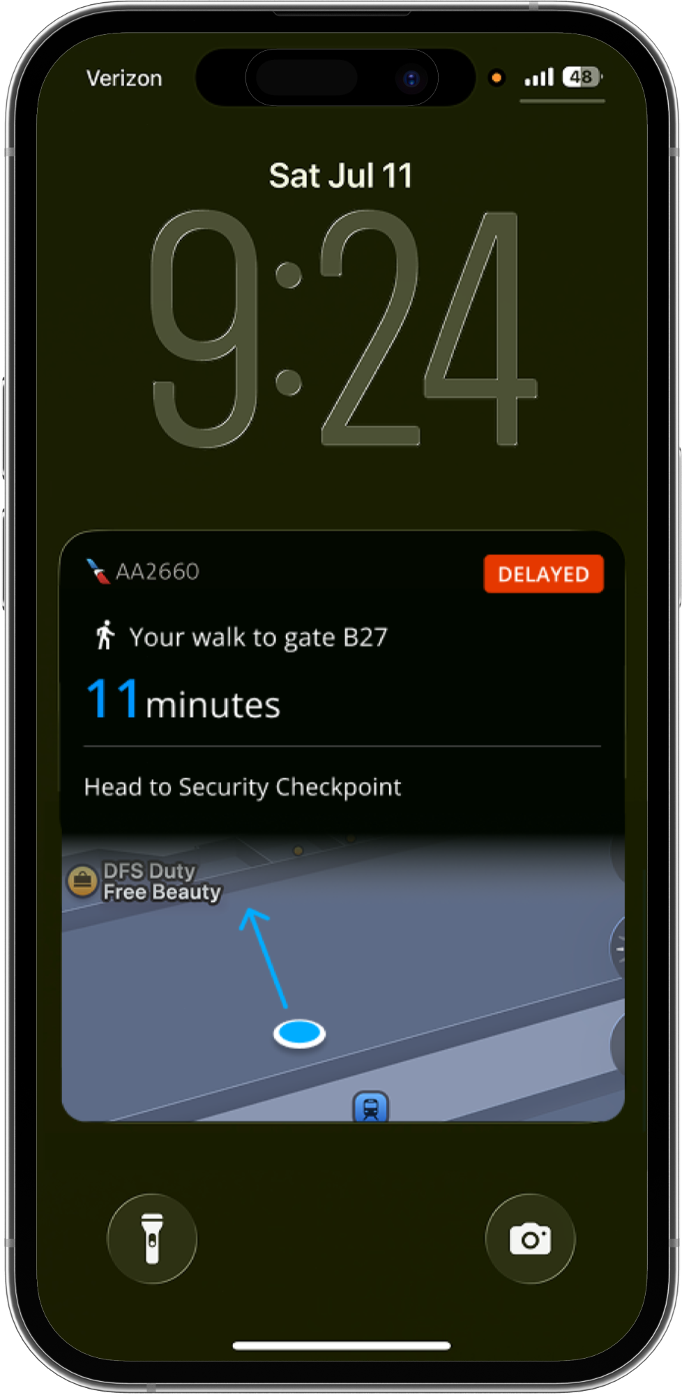
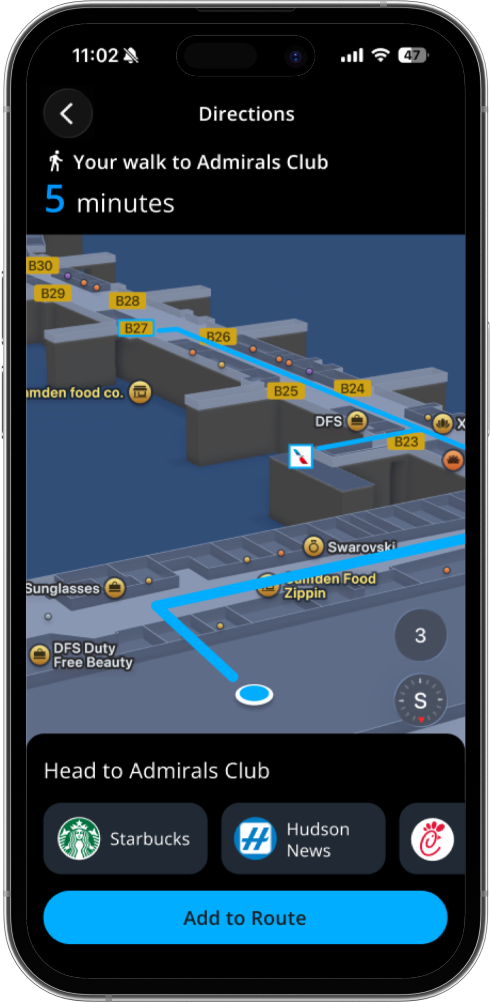
The result is a redesigned AA dashboard that replaces a fragmented, multi-app travel day with one predictive hub — from transit notification through boarding.
09 — Reflections
Reflections & Next Steps
Working within a 16-week program timeline meant balancing depth of research against speed through wireframing, prototyping, testing, and iteration. The biggest design challenge was proposing features that could realistically integrate into American Airlines' existing app architecture rather than existing as a standalone concept.
Next, I plan to run a second round of usability testing on the updated high-fidelity prototype, document findings from that round, and continue iterating based on what surfaces — closing the loop between research, design, and validation.